AECP Final Challenge Level 2 Part I
Hello everyone!
Today I’m sharing Part I for my AECP Level 2 Final Challenge. The goal was to create four masculine cards for four different occasions.
I don’t do that often masculine cards so I really needed to get creative.😅
I started by doing a brain storming and wrote down alle the things that I relate with masculine cards like colors, themes. And I also pulled out a lot of stuff that I could possibly use. I tried too use geometric dies/designs and plants for an organic look.

To help me plan everything I generated pages I could use for sketches and color combinations. So I always had the overview and could really design my cards well.


I also worked with the color catalogue – this helped me to find different shades of all the masculine colors. I pulled out a lot of color combinations that seem masculine.
I started the sketches by choosing a shape I want for the card. Then I thought about witch elements I could use like stencils, stamps, embossing folders.. And also for what occasion this design will fit the most.
And finally, I choose a color combination that brings everything together.
So my design came together like this:
- Shape
- Elements
- Color
And of course I went back and forward a few times and then finally changed everything up while crafting, because something didn’t work or I didn’t liked how it turned out. But this for me is one of the greatest part about crafting – getting creative!
I also had to choose 3 components from the ACEP 1&2. Well actually I could take all of the components because you have a little bit of everything in all of the cards like adding details, choosing colors. But I went for these 3 components:
- Cards with a twist – this was my main goal. A really wanted to created special shaped cards – because, when I think of masculine cards, it just went in my mind, that boys like to play. My husband totally agreed! 😂 So they're having more fun with my cards.
- Easy Ink blending techniques – I love to add ink to my projects. I add Ink to backgrounds or to die cuts. This gives always so much dimension.
- Let it shine – I thought about to add shine to all my cards.. not that glitter shine that seems a little bit more feminine – more like a metallic subtle shine, that also adds interest to a card.
I also have created a little reel on Instagram to show the shapes of the card a little bit better than only with pictures.
You can watch it here: Instagram Reel
So here are my cards:
Thinking of you card


I cut another geometrical form from white paper and added my sentiment. It is from the Monsteras an Quotes Stamp Set. I stamped it with a dark brown and then added clear embossing powder on in. This gives that little bit of shine what makes the card more special. I also used the frame die from the Geometric Frames and did the same: added brown ink and clear embossing powder. I think it looks like steel and gives a cool industrial look, that I think is masculine too.

I didn’t like the spacing from my sentiment, so I added a little heart. I used a leftover from my inked panel so it catches up the colors again.
I might add a white panel inside to the card, so it’s easier to write on it or I’m going to use a white gel pen.
Encouragement Card

For this card I started by ink blending different shades of blue on a white panel. I went darker on one side and went brighter on the other to create an ombre effect.
Then I created all my ginkgo’s. When I know that I want to create a lot of pieces I find it easier to create a little jig. So I start by die cutting all the pieces and then I’m going to add the ink. I think like this I’m much faster, because I don’t have to line up everything all the time.
The gingko from the Sweet Gingko Stamp Set has a solid stamp – I didn`t only add ink with the ink pad, instead I used a blending brush, so I could go darker on the bottom and brighter on the top. I also used two different colors.

The veins I wanted to add with embossing powder, but they were so fine and with the powder they dint really show up anymore. So I decided to do them with ink. But now the part of adding shine was not fulfilled – so I added on top of the vein’s strokes with a glaze pen. It’s hard to capture on the picture, but in real life it gives a nice subtle shine.
For my easel I a cut half of a card front away. I added a score line in the middle of my inked panel and glued these two together.

Now I started to placing my gingko’s over this line but only glued down the under part.
The rest of the pieces I scattered around the others.

For my sentiment I used a white embossing powder on a matching card stock and adhered it right on my ginkgo’s, so its floating in the air when the easel is open. I’ts from the Rocktrompet Stamp Set.

I created a square that is going to hold up my easel.
I also did white heat embossing for the sentient on the inside of the card.
It’s also from the Rocktrompet Stamp Set and I found it’s like a double motivation when you find an encouraging message on the inside too.


Anniversary Card

The next card is a gatefold card that opens in the middle, after opening a little door 😄
I cut different colors of card stock with the Garden Trellis Cover Die to create a Die cut inlay.
Before I started to inlay all the die cuts, I ink blended color on the panel grids and addend clear embossing powder to achieve that same industrial look and that little bit of shine.

After finishing my panel, I cut it in half. Always the hardest part after putting so much effort into something. But fingers crossed all went well!😅
For my card base I cut a paper in half and added score lines on both side of the cards so that it opens up in the middle. I glued my panel on top of it.

Now I created to smaller and one bigger squares to created my little door. I added some faux stitching on the background with a die, so adds more interest.

On the big square I stamped congrats from the Feathered Lilies Stamp Set and again added clear embossing powder for that subtle shine. Then I cut a little hole in my square and into my card panel so I could adhere my clamp. I also glued a clamp to the other side of my square but without the legs, so the design looks even and for the recipient there is a little bit more guess work how to open the card. I love that the clamps also add more of this metallic shine. Now you can slide the square up and down under the smaller square.

I stamped a sentiment from the Sweet Bouget Stamp Set on the inside and used some of my leftovers squares from the die cut inlay on the inside too.

Birthday Card

On my last card I used Cutouts who are called Nested Wreaths. I had them from my first Retreat ever with Altenew and actually totally forgot them. I found them digging trough my stash as I was looking for masculine elements 😊
I colored them with Forest Fern ink. My sticky mat holds them in place and with a large blending brush I was quite fast. I also added a little bit darker shade on the bottom of the leaves.

As I wanted to glue them on my panel it looked a little bit too naked. So I decided to add faux stitching on the background. Then I glued them down straight as possible, so they look like Lianas.

Then I took a rectangle die and cut out a window. I did the same ond my card base. Then I glued the inner piece on the inside of the card. I first wanted to create a shaker window, but then I thought there is already too much going on. So I just created a window with acetate an added a rectangle frame.

For the sentiment I hot foiled the Essential Alpha Hot Foil with Petri Foil. This again gives this light shine that looks metallic. I then colored the letters with Markers. I really love how the sentiment turned out.
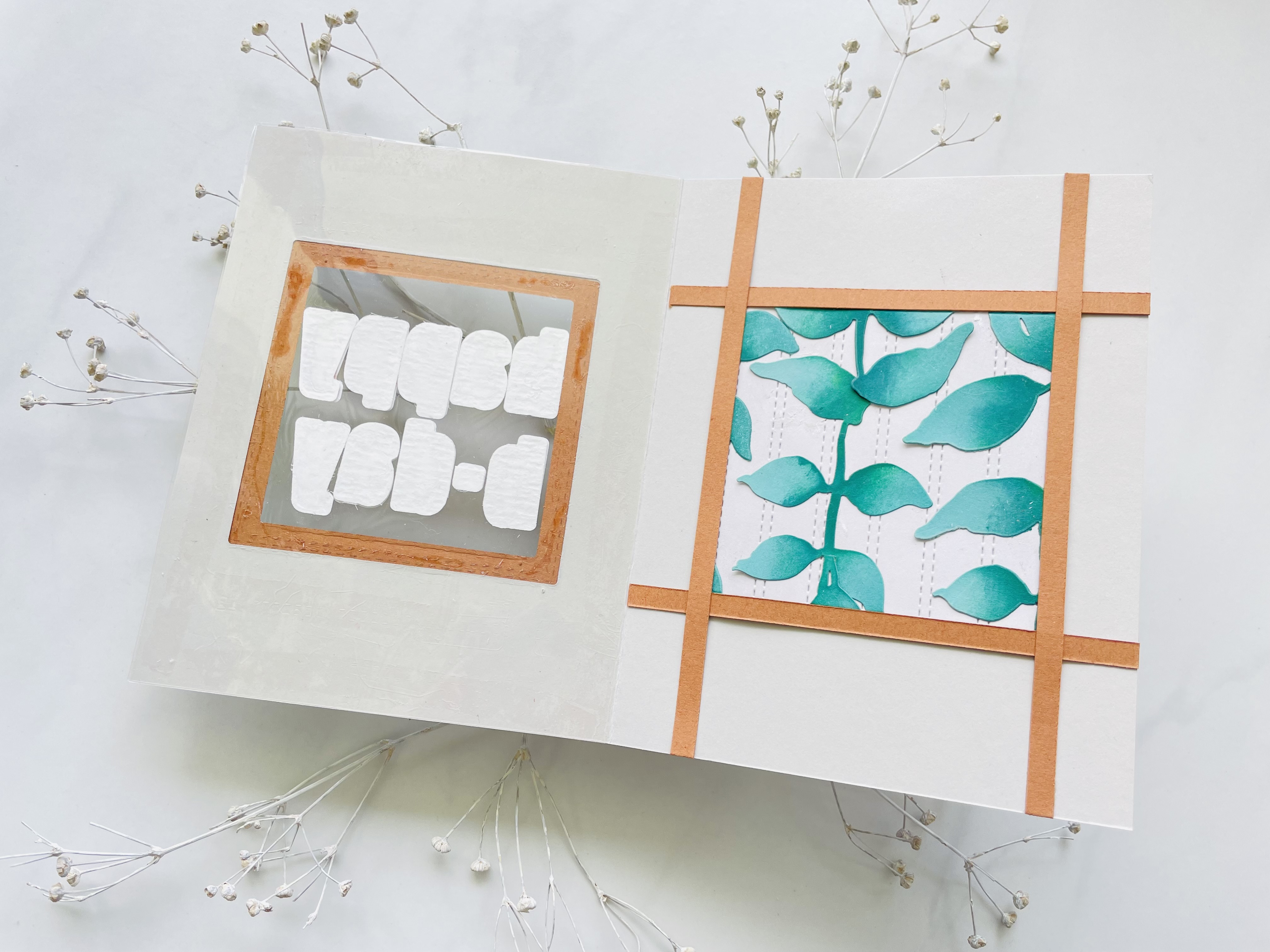
On the inside the square with the plants looked too plain. So I added cardstock stripes to give it a finished look.


Sooo these were all my masculine cards..
But there’s also a Part two for the Challenge, so stay tuned! 😁


Comments
Post a Comment